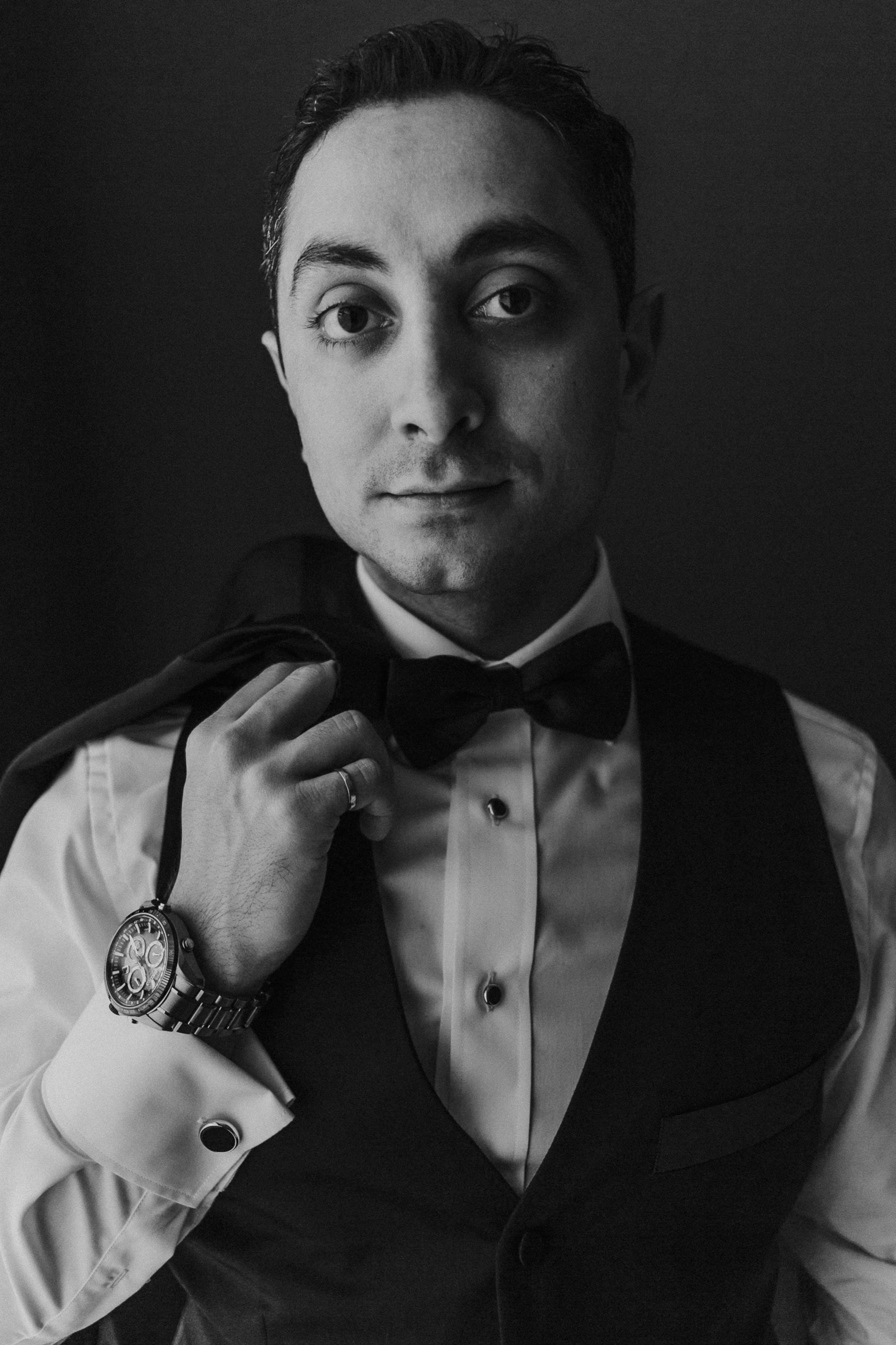
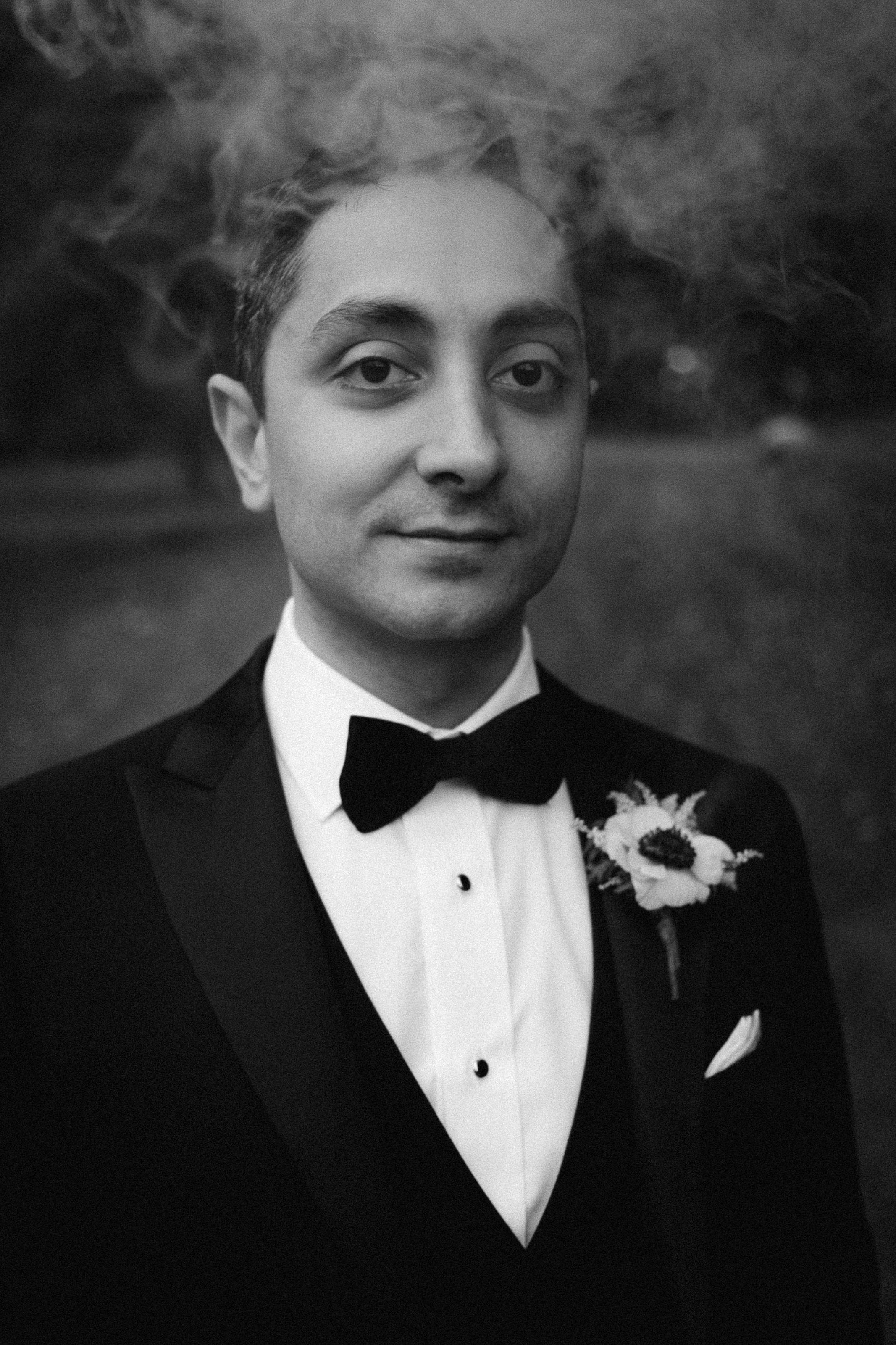
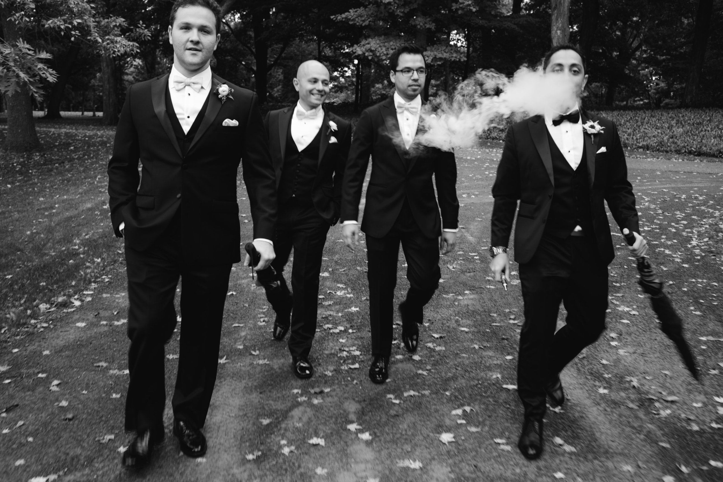
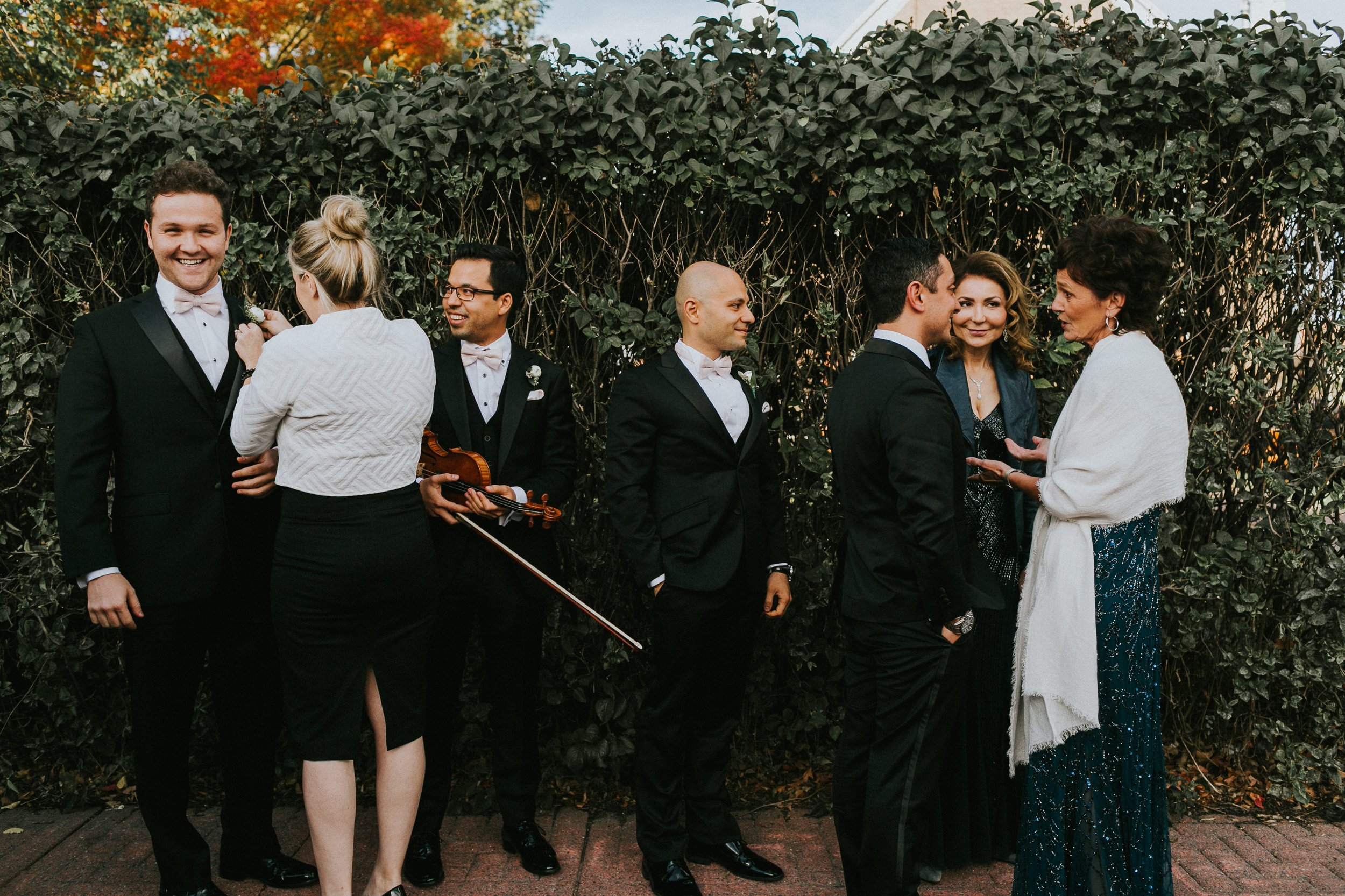
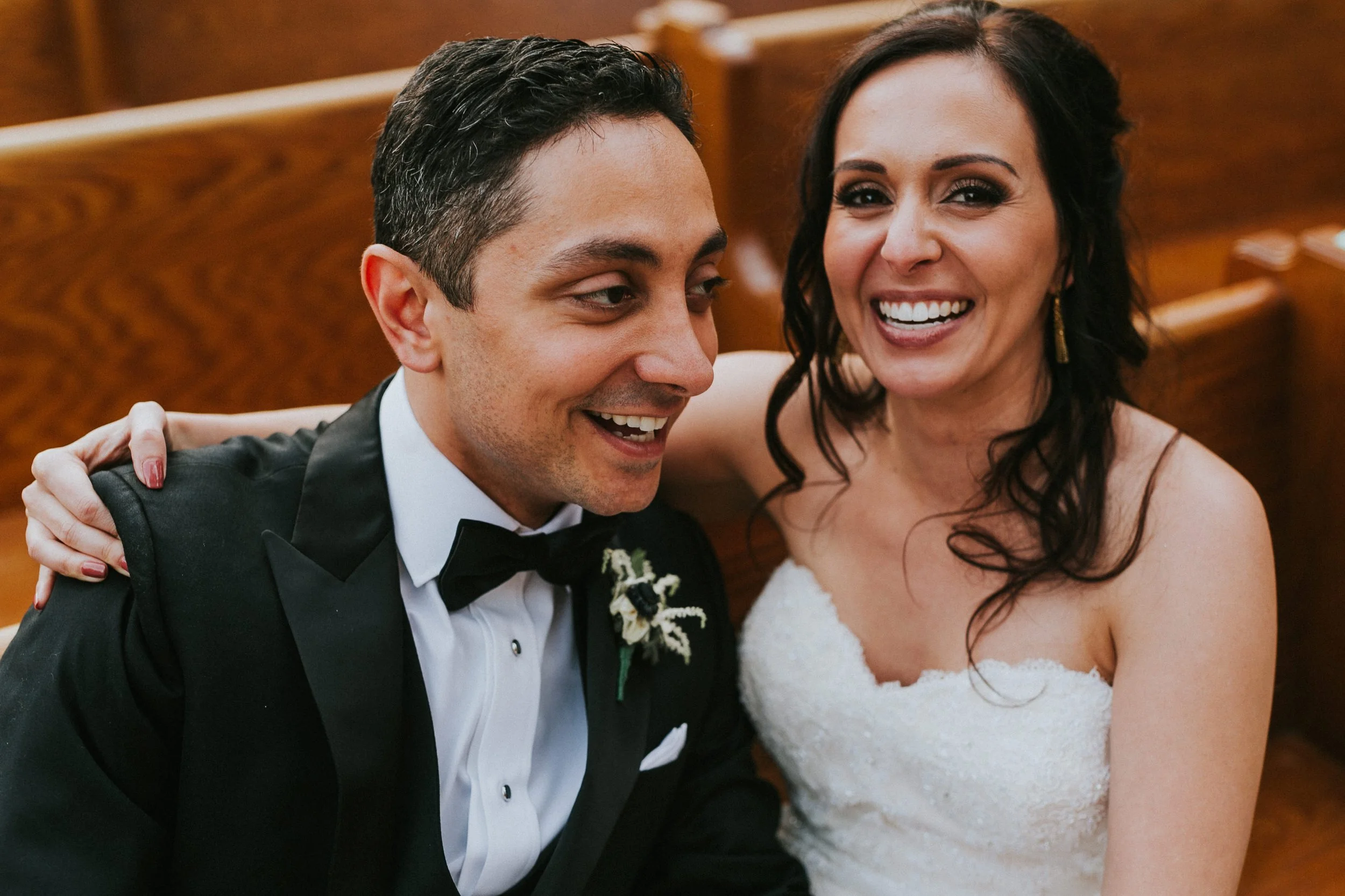
I first met with Samantha and Amin back in the summer of 2013 at small coffee shop in New Edinburg. Little did I know this potential client was about to give me carte blanche for what would be the most amazing concept to creation a planner could have ever dreamed of at a super exclusive venue. A space which will only ever see one wedding. Samantha & Amin’s.
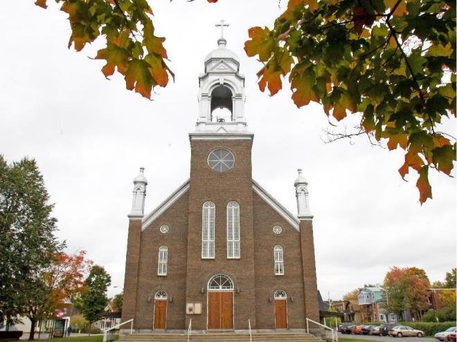
When I first walked into the reclaimed church Amin & Samantha has chosen for their wedding venue I could immediately see the space transforming in front of my eyes. I've been asked about my creative process, and it's something I can't quite put into words. The best I can explain, it's like walking into a space- closing your eyes, and reopening them to see the space completely transformed by my creative vision. As I walk through spaces I can see them transforming almost as if I am in the future present wedding day.
The church itself had been gutted with no immediate plans for any renovations or improvements. Patchy paint, green stained parliamentary looking carpets, 60 scattered unhinged pews, no washrooms or running water. The church in day-light looked weathered. But at night it emanated character of an age gone by and an old world ambiance almost as if you were in transported to little Italy.
The opportunities this church in shambles provided were endless and by the time we walked out of the space I knew exactly every design element and the vendors needed to make this an absolutely gorgeous wedding. The work in front of me was tremendous. It would take painters, carpet cleaners, movers and a dedicated team of vendors to transform this space. And the parents of the Bride and Groom were skeptical, and I was up to the challenge!
CURATED DESIGN PROFILE
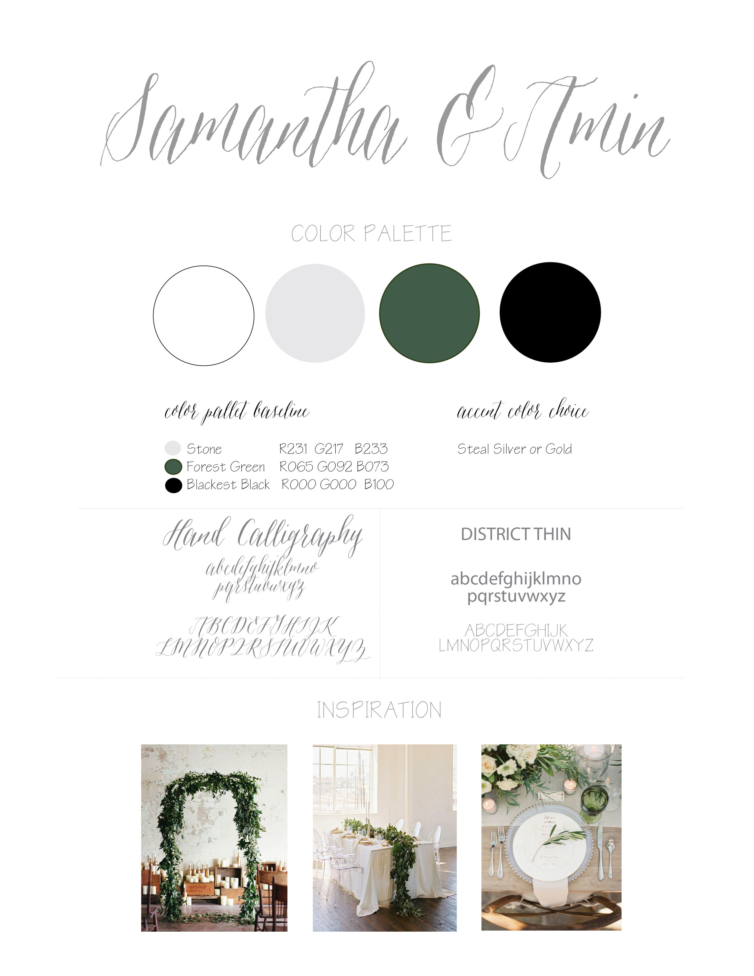
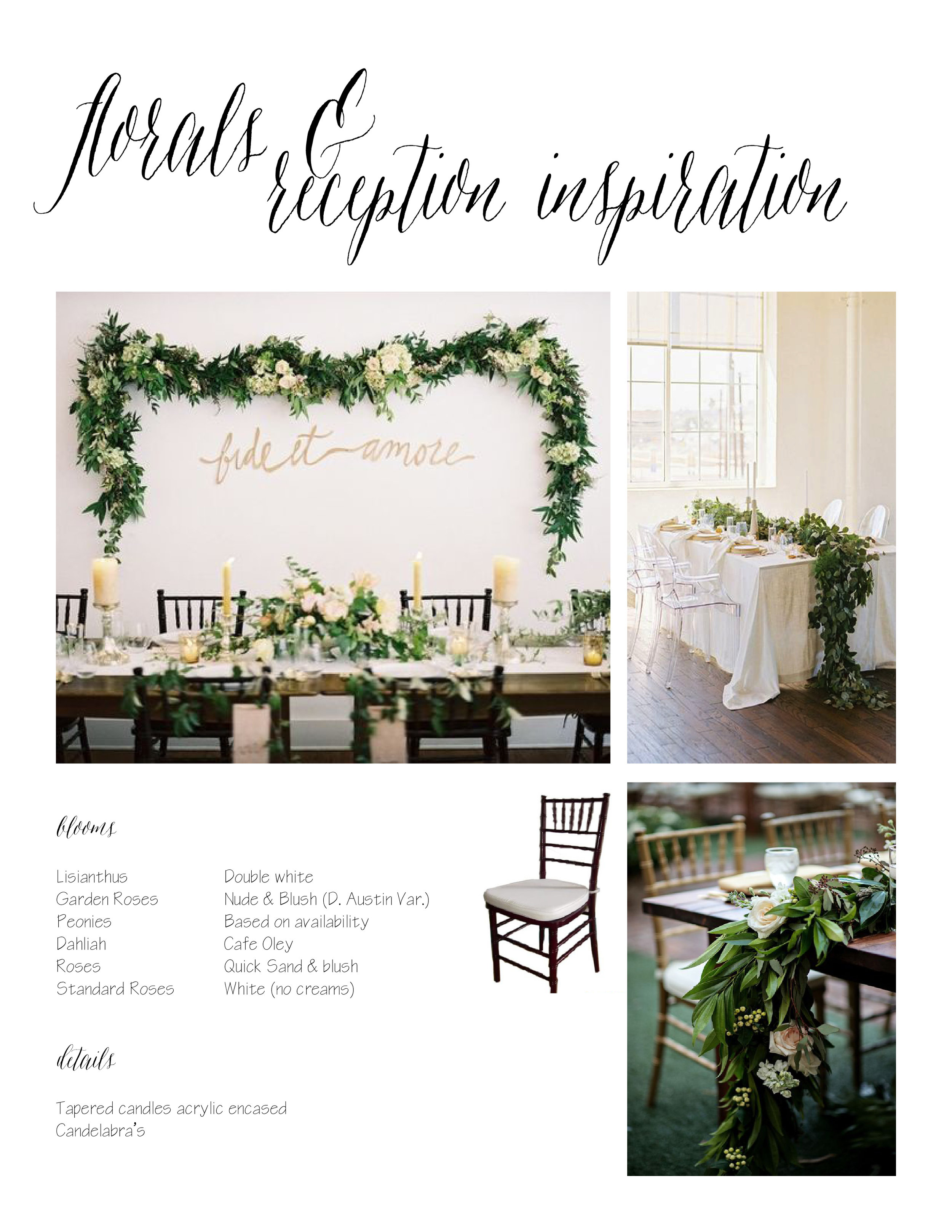
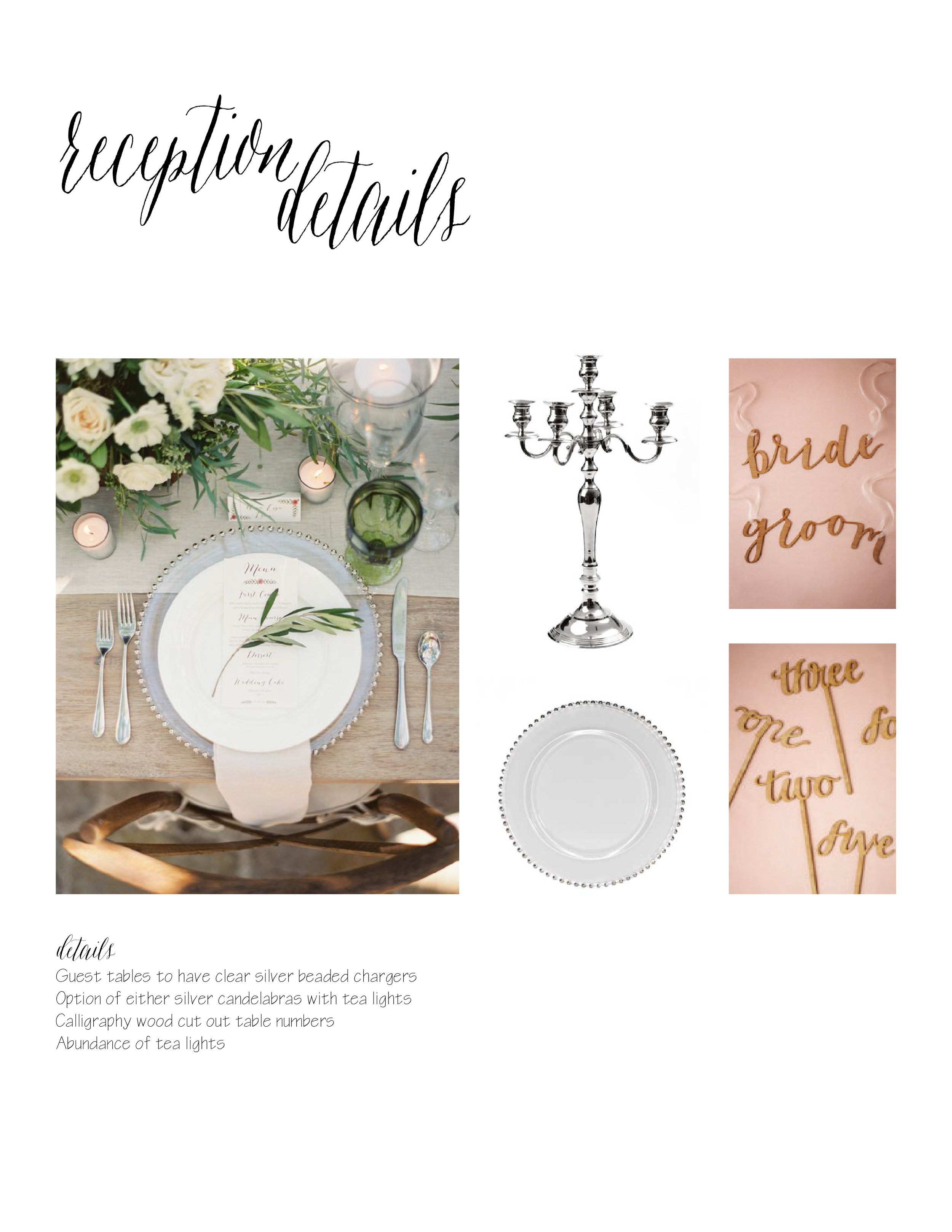
Before I take you on the journey of this wedding transformation and we delve into the before and after pictures, we should begin with the vision. Our Design Profile we created for Samantha & Amin in 2014. This was great way to provide a glimpse into the future of how our initial style boards come translate to "the day of".
I do have a very specific process of how we plan and design a wedding. The very first thing we do is establish concept and priorities, solidify venue, then move into design, choose a photographer who will document the wedding according to the clients overall design and style, and lastly secure reputable vendors to ensure a strong cohesive look and feel based on intention and fore-thought can be brought to life. For this we need strong visuals to convey our thoughts. And that's just the beginning. Below is a small snippet of what our Design Profile looked like in 2013. As you can imagine- things are very different 10 years later in 2023.
About our design
CHURCH PEWS
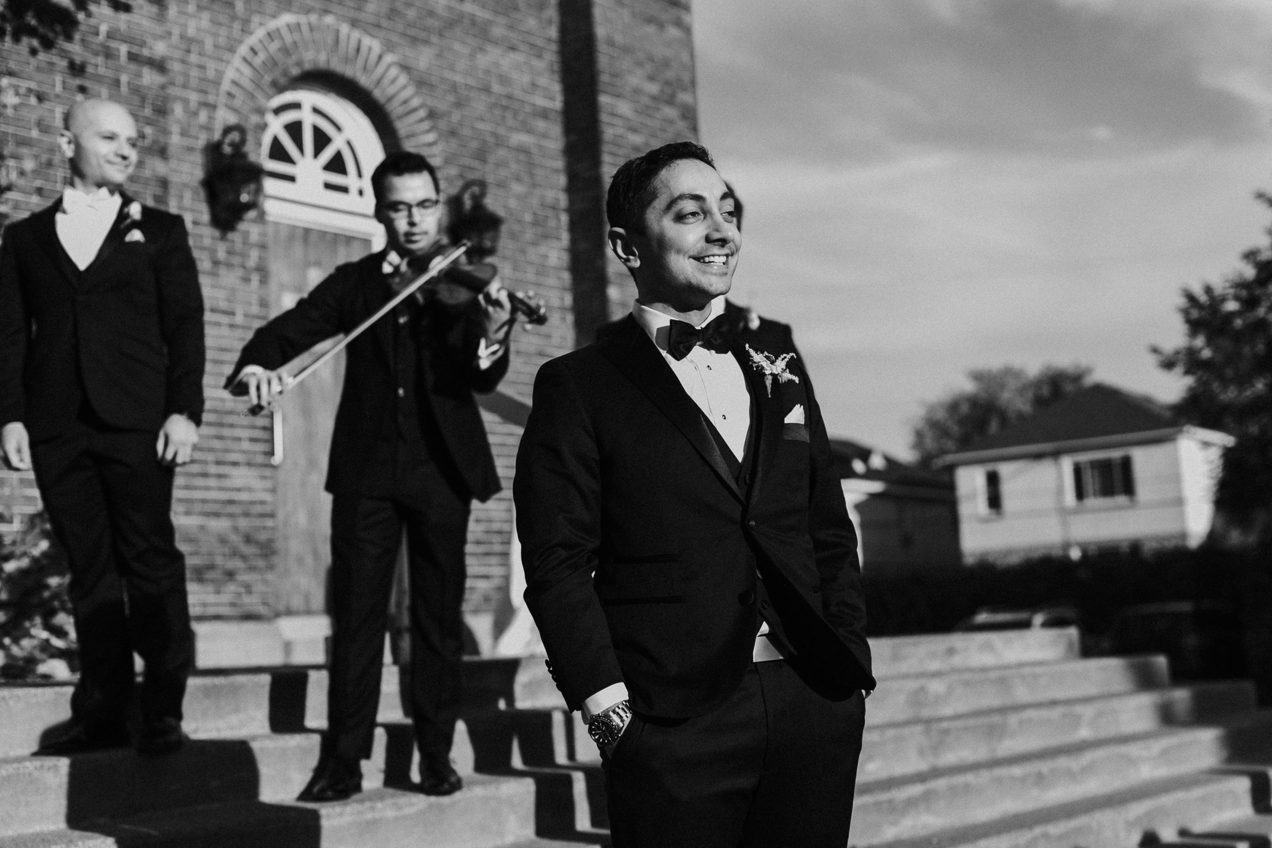
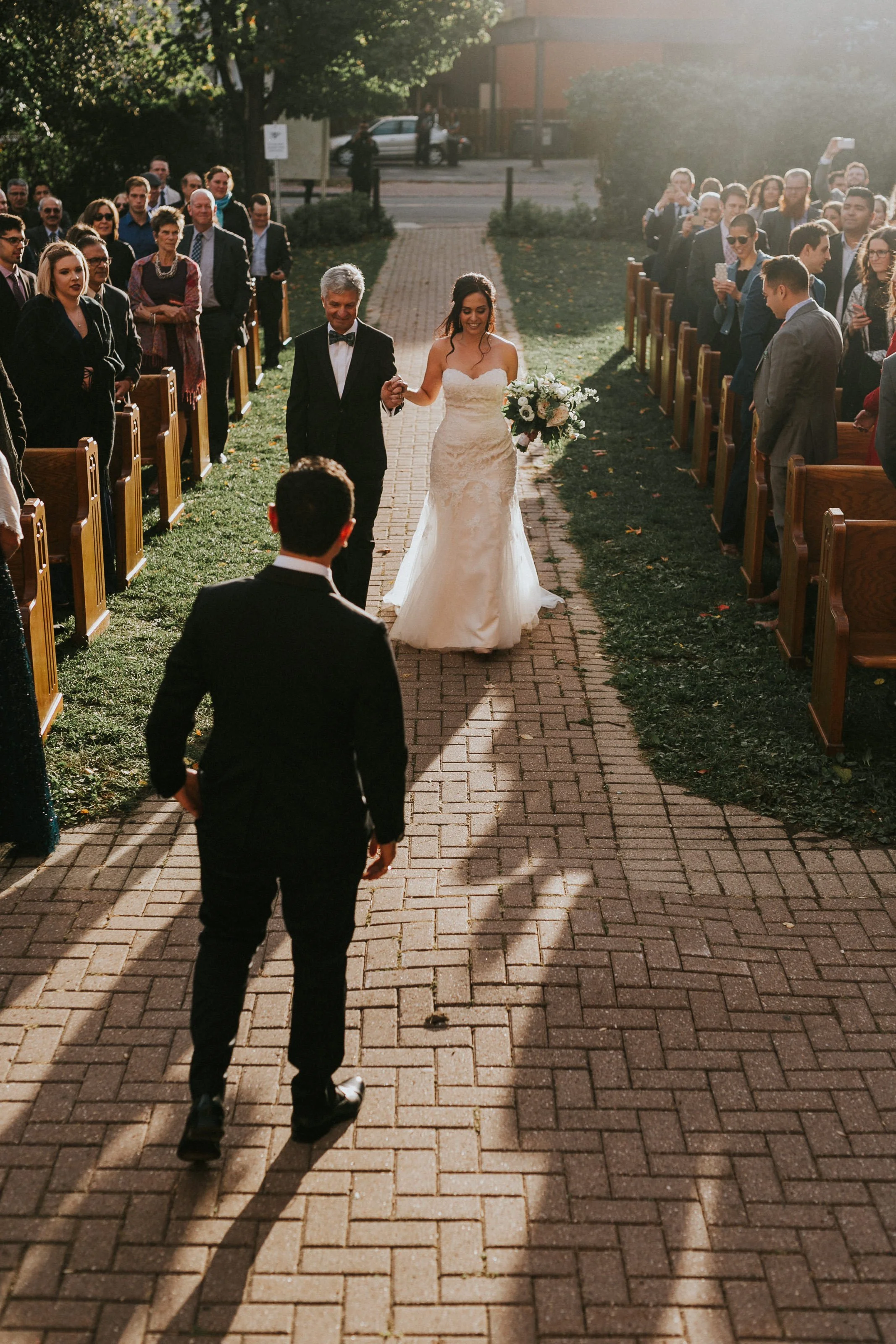
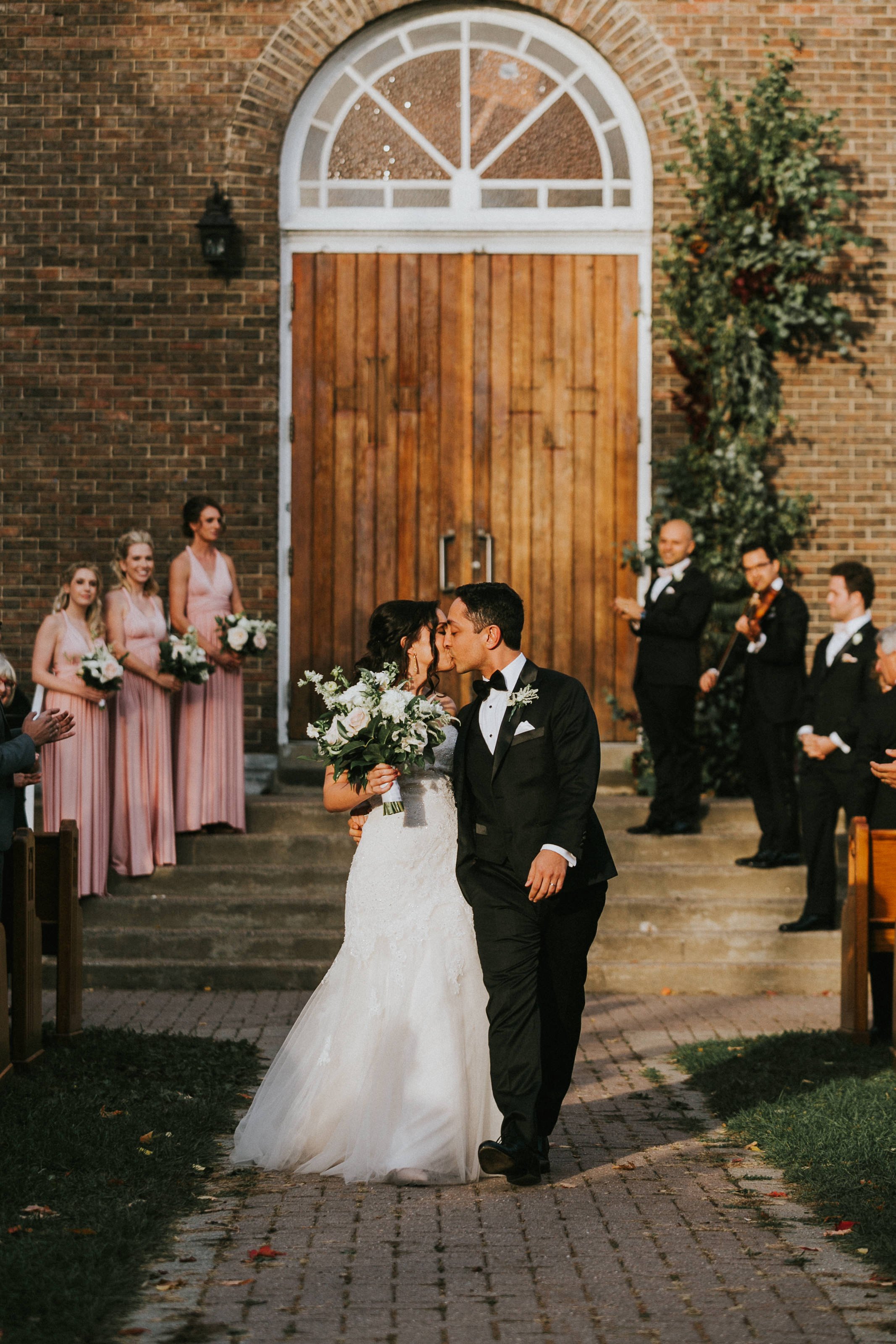
Since the "church" was now desacralized everything was fair game. This meant we could use the space however we wanted. During our meeting Samantha said something that really resonated with me which unintentionally became the driving force behind our design. She said, her grandmother always wanted her to have a church wedding, but that she herself did not want a traditional "churchy" wedding. It was almost like a light bulb when off inside my mind.......no nuptials inside the church.....we're going to bring all the pews outside on the lawn and we’ll mary on the steps leadings up to the church. She loved the idea! Little did I know the groom was a New Yorker and didn’t enjoy the outdoors and more specifically bugs.... good thing I'm a great convincer!
BANNERS
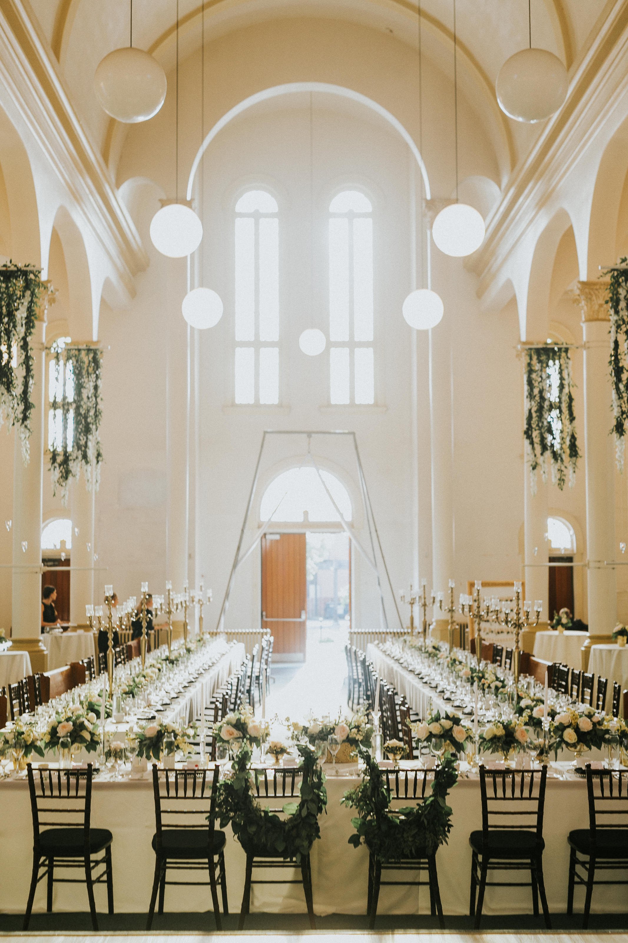
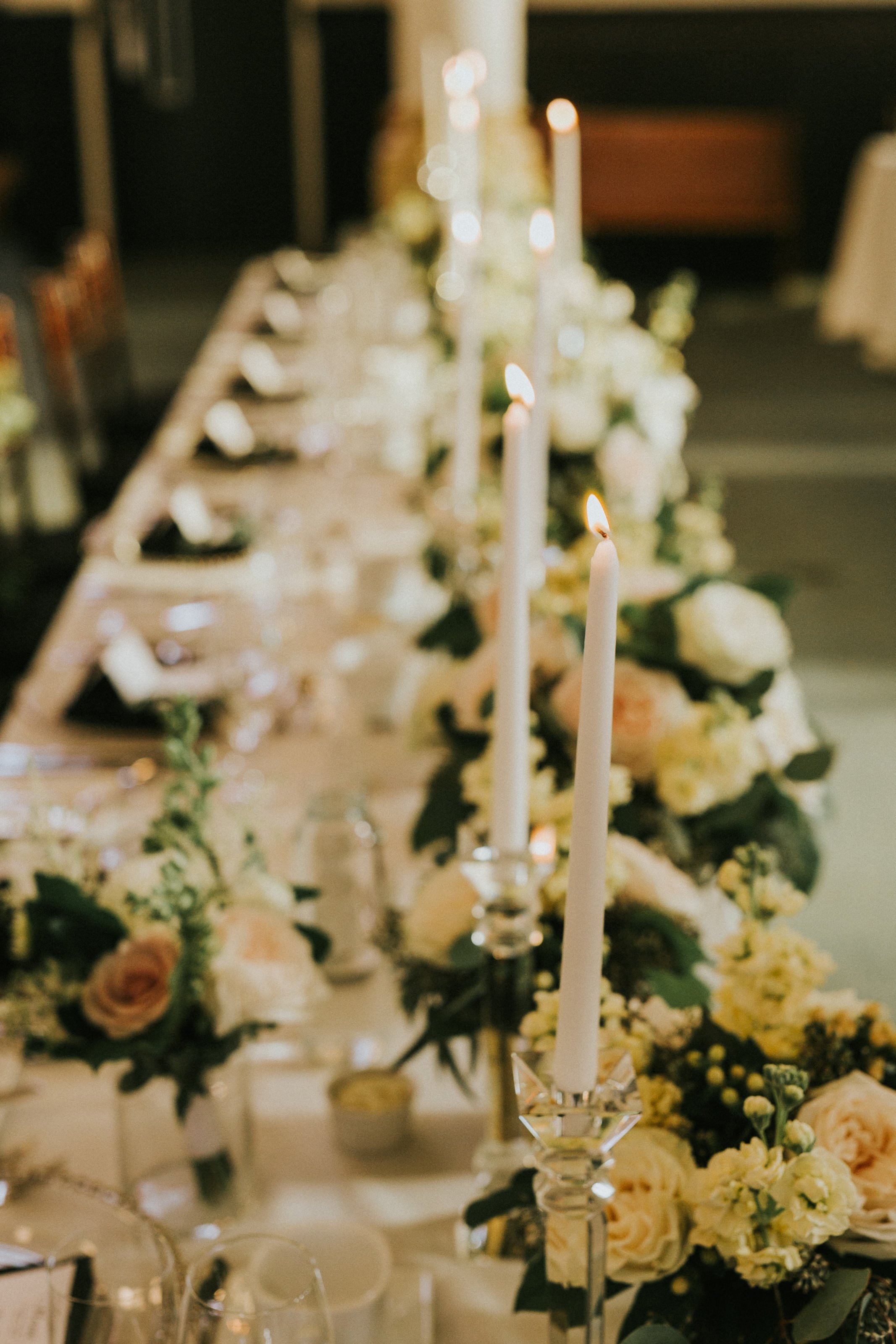
I tend to pride myself in incorporating a unique design element which I like to call the "Piece de Resistance" that will leave a lasting impression with guests. Something slightly extravagant and unlike anything else you've seen at a generic wedding. on the furthest right picture below you will see unsightly purple banners. I turned these into suspended waterfall florals with hanging candles. An ethereal floating element that would not only enhance the space but capture the guests attention in the evening with its glowing candlelight.
SUBTLE GRAND ENTRANCE
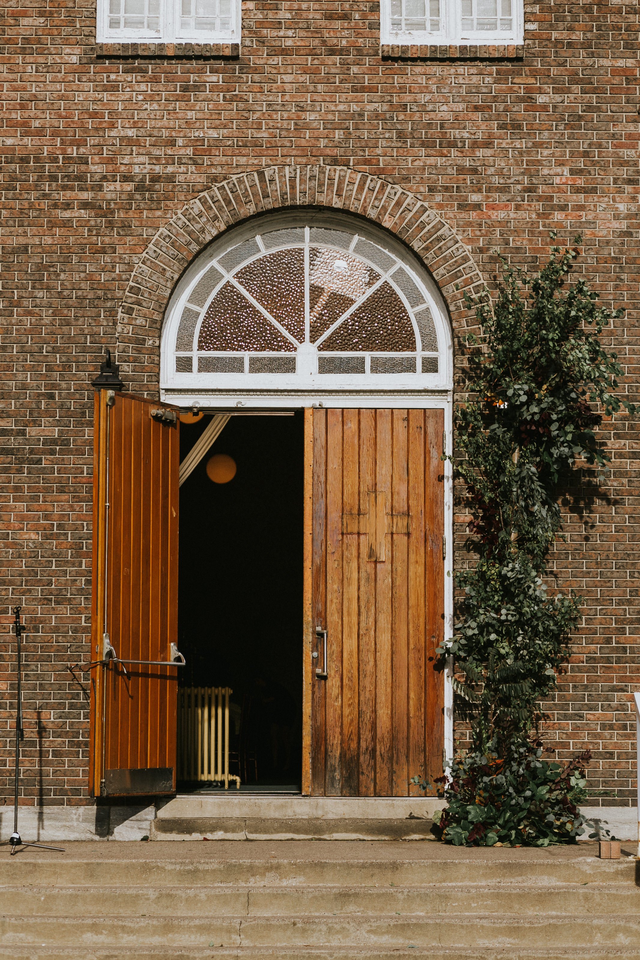
As our official altar and entrance to the venue was a bit baren. I didn’t want an extravagant floral arch as we too commonly see. So we created an asymmetrical climbing vine to soften and accentuate the doorway. It was so perfectly designed, guests thought it was part of the landscape and had been growing there for years.
LAST MINUTE SURPRISE
Two weeks before the wedding the groom spontaneously requested some sort of entertainment.. “like maybe some fire dancers."
My reaction.... "Ummm what?!. lol let me ponder on that for a bit!".
My thought process thereafter: fire + old church divided by insurance = what better options may we be able to incorporate… interpretive dancers in glow in the dark costumes- was that even a thing? Aerial Silks.
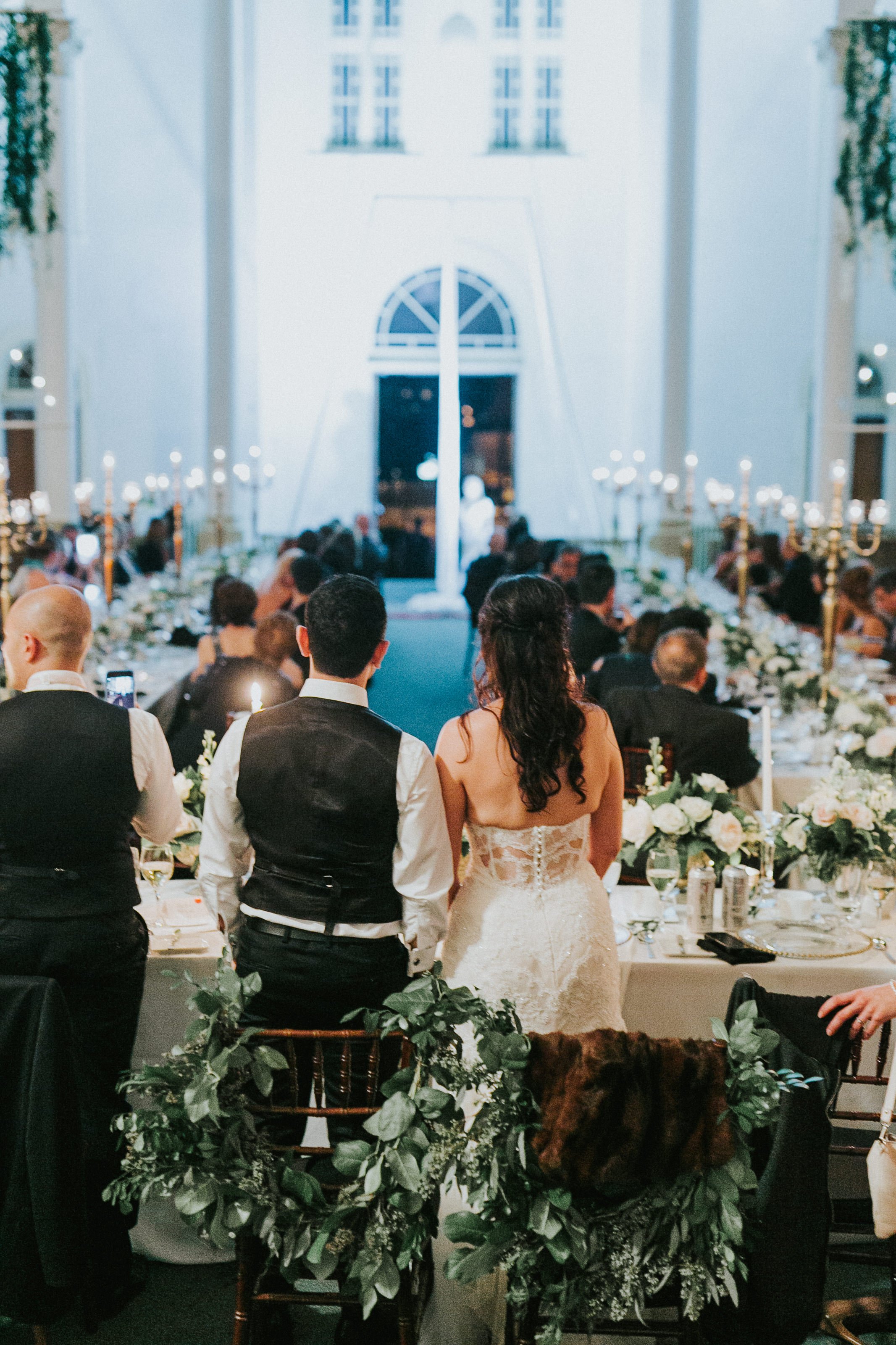
But this generated a new problem; space was tight and I needed to find a creative way to incorporate a 20ft structure into the venue without it looking like an eye-soar. It also had to be dismantled before the night was over with guests still milling about and I personally hate moving things while guests are using the same space as it’s disruptive. This structure was a couple hundred pounds and took 45 mins to set up and would equally take as long to be taken down. If you look closely in the picture to your right, you will see that I situated the acro structure at the back of the venue right in front of the main doors. I took a huge risk in its ultimate placement but I also felt like a genius when every guest walked into the space underneath this structure but only noticed it's presence when it was show time.
Below you can see more of the the space before and after our transformation.
FUTURE RECEPTION AREA
ALTER BEFORE DANCE FLOOR TRANSFORMATION
RECEPTION AREA WITH PEWS REMOVED
ALTER WE REMOVED FOR DANCE FLOOR
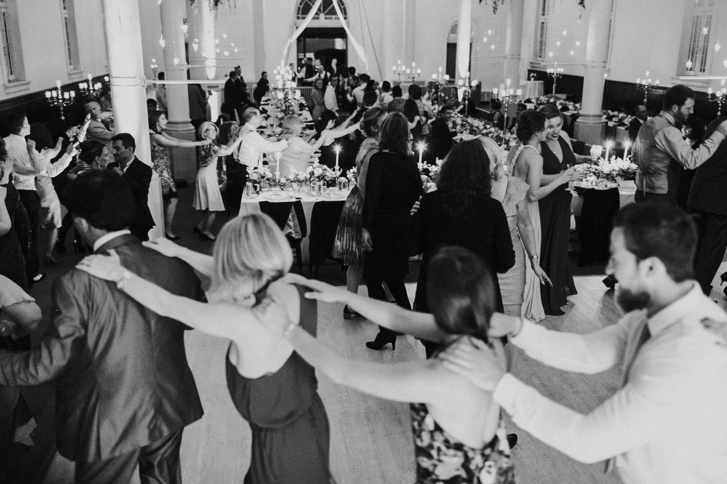
Fast forward to the wedding day, dinner is coming to a close and the skeptical parents I mentioned before presented themself at our vendor table graciously imploring our efforts as they could not believe their eyes and how we had transformed the space. They thanked us for making them feel as though they had taken a flight and were celebrating their children’s wedding in Europe.
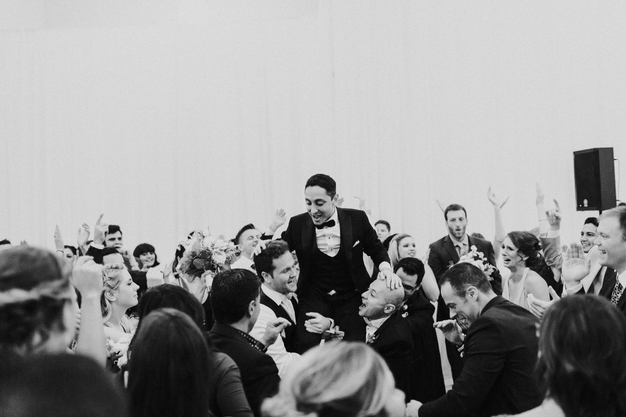
Full gallery captured by Joel & Justyna below
THEIR STORY UNFOLDS
WEDDING PLANNER: Toast Events, Elise Schmitz, Madison Kelly, Victoria Denofrio, Allie Darwin
CONCEPT & DESIGN: Elise Schmitz Toast Events
DECORATOR & FLORIST: Wedecor
PHOTOGRAPHER: Joel Bedford Photography
CATERER: Tulips & Maple
OFFICIANT: Exceptional Ceremonies
LIMOUSINE: East Coast Limos
INVITATION: Minted
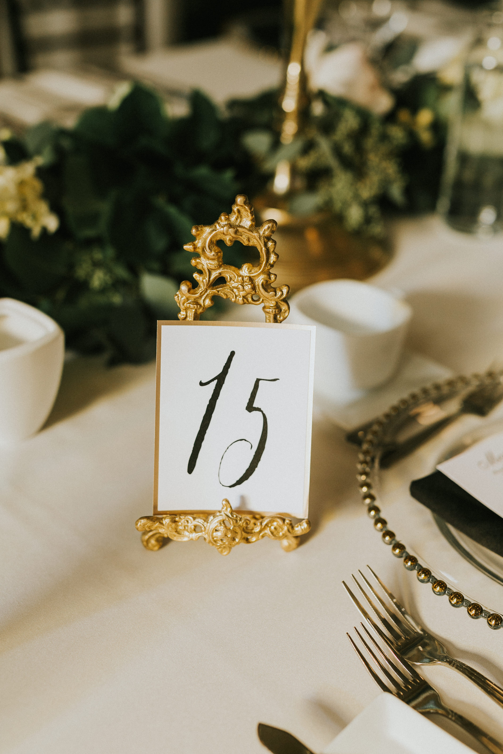
TABLE STATIONARY: Wedecor
CAKE: Thimbles Cakes
MAKEUP: Natalie Peachy
AERIAL SILKS: Quality Entertainment (Montreal Acrobats)


