How do you design for a client that requests an androgynous no colour wedding? It's a tricky question to say the least and it made me rethink my usual creative approach. Because our planning style is very concept driven, our first step with clients is a request to provide 25 inspirational images of how they envision their wedding day. This gives us a glimpse of what they naturally gravitate towards and provides a jumping off point for our design work to begin. Essentially we take these design details and build upon them taking it to the next level in ways they may have not considered before.
So here is a snap shot of our brides images.
HER DESIGN SPECIFICS
Here's what I see at first impression.
- Bold metallics
- Absence of colour
- Stripes
- Tight-knit flowers
- No greenery in florals
- Dark linens
- Traditional design aesthetic
- Layered elements
- Geometry & symetry
- All around visually heavy design
A challenge right!? How do we take this inspiration and transform it into a more luxurious and effortless look? It's actually an easy answer. Get to know your client. During our conversations together it was apparent that decor was obviously very important to the her.
“Everything needs to be over the top. Just a little extra you know?”
Theatre St James photo via website
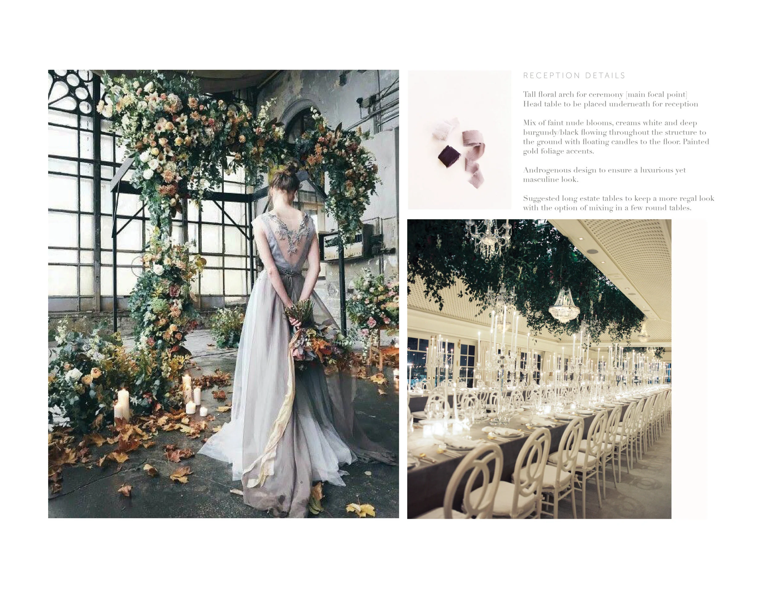
Number one on my list- we had to add colour and loosen up those tight-knit florals while keeping everything androgynous. So I thought to myself, what colour does she gravitate towards in her wardrobe subconsciously? Nude. Next hurtle, how do we move away from black? Answer- Midnight Aubergine.
And so her perfect pallet emerged. Now- the challenge of making this unique palette pop with something of editorial quality.
I take great care in designing all our weddings in a style and form which could be publishable. This requires adding elements which aren't normally seen everyday. Needless to say, I try to set the bar high. For this wedding- gold dipped greenery and metallic misted ferns throughout her florals was that added element.
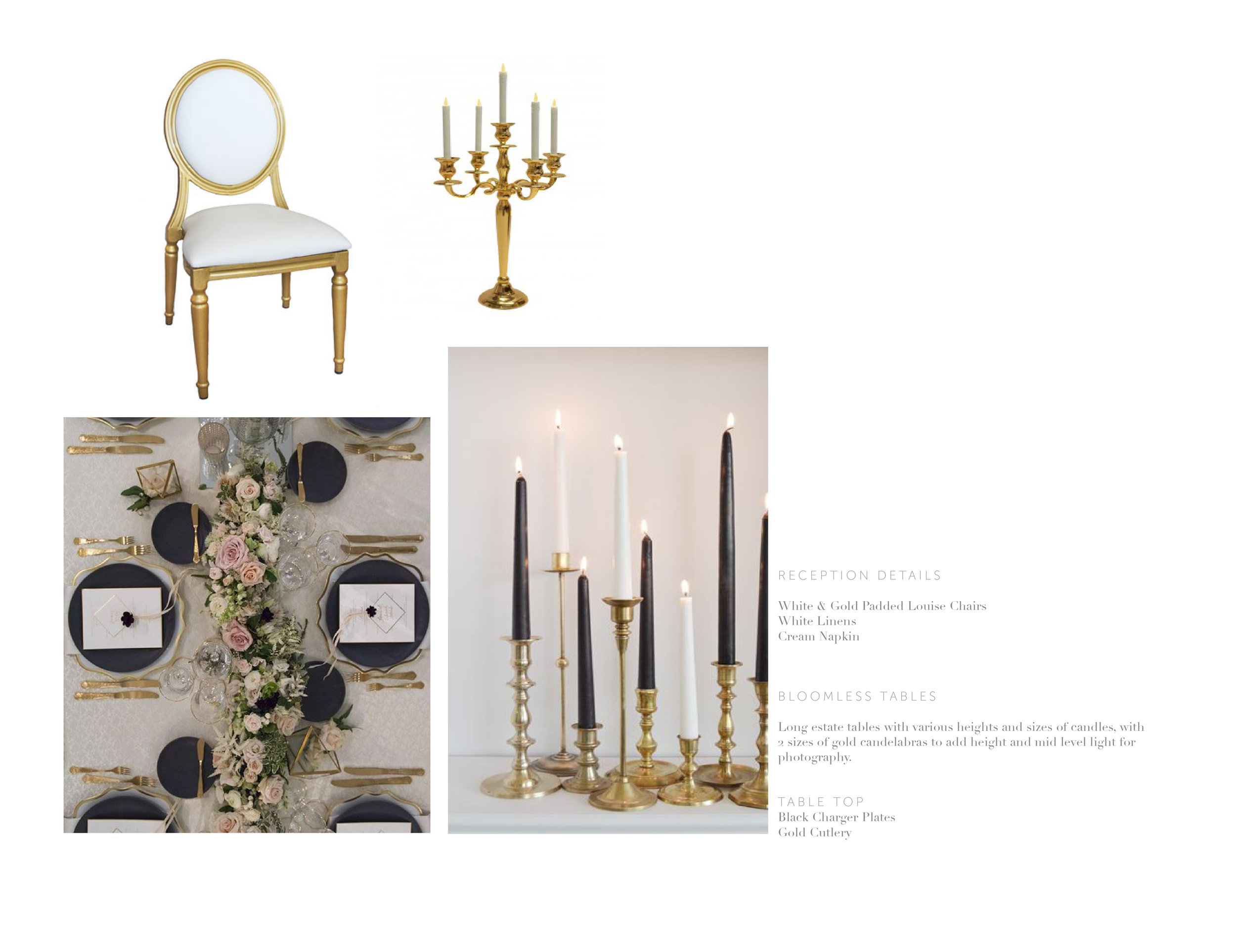
To keep this wedding luxurious, we decided to put our whole floral budget into a floral canopy which will host not only the nuptials but then transforming to frame the head table during the reception. And here's the kicker- I look at it this way. What do the photographers photograph the most during the wedding? The bride & groom. And where will the b&g be for %80 of the time? - under this insanely gorgeous canopy. So in the end all their images will look ultra luxurious full of gorgeous blooms, candlelight and crystal. I know what your thinking? But what about everyone else. Well, they get nothing- jusssssstttt joking! Long estate tables with different heights of candelabras and hundreds of candles. Not one single bloom. And it's perfect.
I think its needless to say that we'll be doing a before and after blog post on how we transformed the space with tons of detail pictures. So stay tuned ;) August is right around the corner!
xox


